In future, we’ll be working on pattern design in the open, so anyone can join in, and anyone can see an ‘as-is’ version as a pattern comes together.
To join in the conversation about creating a maps pattern, add a comment below.
Maps
Background:
Many NSW Government websites contain maps and map-based data, but there is no single approach to this in terms of visual design, interaction design, or tech. We’d like to create a NSW Maps pattern so that anyone using maps can inherit a tested, brand compliant, and accessible approach.
Overview
Maps allow you to show data relative to a physical location.
When to use maps
Use a map when your users need to see the location of things relative to each other - for example locations where they can access a service.
Do:
Make the content available without using the map
Use an appropriate zoom level by default
Test with users to make sure a map is the right solution
Offer a text-based alternative for those unfamiliar with the area geography
Do not:
Rely on users being able to use a map
Use colours to denote meaning without an alternative
Interaction Design & Usability Research
When placing maps on a mobile view, make sure the user can still scroll the page by keeping the map’s aspect ratio different to the user’s screen
TBC: Preference for users when placing a location - either drag the pin on static map tiles, or drag map tiles to a static pin
Mapzen also looks like a good open source option which would allow us flexibility with tiles and overlays, but an existing gov solution would be better.
UI Design
[TBD - currently backlogged for the Design System team]
Accessibility
EDIT 7/2/21:
AccessibilityOz and the BOM have done a lot of work on this, and it’s licenced in a way we can also adopt it (and maybe add some specific NSW bits if they come up) - read their findings here - Interactive Map Accessibility Principles - AccessibilityOz
Credits
These awesome collaborators have contributed insights, knowledge, and time to the information above: @Morganay
We use a map for Report to EPA to place and drag a marker to indicate where an incident happened. This populates a text field as well. If the text field is populated first, the map marker drops a pin on the map for you, to confirm the location of the incident.
@Morganay That’s awesome! Does the initial content above sound about right from what you found? It’d be good to add in anything you found from usability testing or customer feedback.
@tjharrop The map uses GPS (if the user switches this on). This feature tested as redundant, as the user was most likely not in the location of the incident anymore. But it does help when the user is in an unfamiliar location and wants the map to tell them where they are. Users would go into Google separately to do this before, so now the map does this. Historically the map was hard to use on mobile, and served as a reference point for users only. The map is now a square on mobile, so that the user can scroll down better when in portrait. The functionality now is that the user drags the pin over the map, and not drag the map to the pin. If that makes sense. In mobile the user can pinch to zoom. We need to do more testing of this new feature when the application is live. I hope this extra detail is helpful.
Oooh, we are working on a couple of map implementations for Transport! One is to find a project, the other is to show the location of the works and impact on a project detail page. Not sure which service we’ll be using just yet - google maps or open streets - but we’ll be layering our content over the maps along with text alternatives and listings to go with it.
We got a lot of customer feedback on how existing implementations were difficult to use, so we are building to eliminate those concerns.
If you’d like a wireframe preview, give myself or @russplummer a shout and we can walk you through what we’re working on!
We’d love to see what you have! Did you make a decision on platform yet? Let us know what your requirements are on the platform so we can get a better idea, in case we build our own (or our own distribution of an existing one)
Hi @tjharrop - here’s a map we published on nsw.gov.au last night for the Victorian border region. The awesome Spatial Services team produced it for us.
Hi Brian, I would like to get a wireframe preview for the map work you’ve done for Transport. I’m from Regional NSW and we were building maps feature for biosecurity emergency. I want to learn from you and hopefully I can give you feedback to improve. Let me know.
Thanks to everyone who has contributed above! We’ve been looking further at the user experience and guidance behind using maps and wanted to share our progress for your input and feedback. Please continue to share your work on Maps so we can add more learnings and continue to improve the pattern.
Search and filtering
The search field should be prominent and it’s accompanying label clearly identifies the input required of the user. Filters should be used to allow a user to narrow down the visible data points by their needs - for example the services or facilities available at a location. The solution needs to be adapted based on user’s needs, including flexibility of filters.
Image: Search with no filters and Search with one filter.
When a user needs to access multiple filters to refine the results, consider offering the text based option first with an option to toggle to the map where appropriate. This allows the user to control the visibility of data points relevant to their needs at all times, and allows them to choose how they consume and interact with the data.
Use listing results to show key information and link a user to further details by clicking on the headline. Where all information can be shown in listing without linking to further info, the standard heading style should be applied.
Column width can be adjusted based on the content displayed to make it scannable and easy to digest information. For example, when only an address is displayed a smaller column width may be suitable, however email addresses may require a wider column width to avoid breaking over two lines.
Suggest changing the “list/map view” button to a secondary button or link so that there aren’t 2 primary buttons competing on the page. I actually created a link with icon as I found a button to be too prominent e.g.
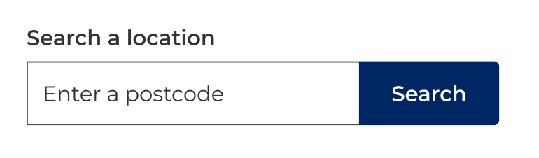
We’ve noticed some usability issues with the search box not having a clear submit button i.e. some users don’t realise that you can hit enter or click the search icon. We’ve started using an input field and button combo to rectify this issue e.g.
Does the map span the full height of the page? I think it should.
Small detail, but I think it would be nice to introduce a shadow to the listings panel on the left to show that they sit above the map.
We’ve started disabling the “Apply filters” button until the user selects a filter to be applied.
Regarding the “show filters” and “map view” primary buttons on mobile, I don’t think we should have 2 competing primary buttons sitting next to each other. I’ve created a link with an icon UI pattern for filters that gets filled when there are filters applied and also displays the number of filters applied e.g.
Did you have an example of the “list/map view” icon links being implemented as it would be great to see? Especially if they are combined with the filter option as we had tried the text links however found they got lost and blended in too much with the current location option. Making map view a secondary button would be a great option too.
We’ve noticed some usability issues with the search box not having a clear submit button i.e. some users don’t realise that you can hit enter or click the search icon. We’ve started using an input field and button combo to rectify this issue.
That’s very interesting and could have an impact on other patterns, is there more you can share with us about that usability testing?
Does the map span the full height of the page? I think it should.
Yes the map has an expand tool to go full screen and will change to the collapse tool when full screen mode is active.
We’ve started disabling the “Apply filters” button until the user selects a filter to be applied.
This is great to highlight so will add it to the guidance.
Not sure where the usability testing is for the search box UI pattern, I just remember it coming up in discussions. You’re right, it would affect all search box UI patterns.
Those look great @adham, thanks for sharing! These will be a massive help to look at how we can build upon our concepts and make the pattern more versatile.
No probs about the search box too, we think it’s the way to go as well so will be updating in this pattern to start with and see where else might be of benefit.
Thanks again and I’ll hopefully have some updates to share with you shortly!
These are really great. Thanks for all your work in this space. Is there anything in particular we need to think of in terms of accessibility? Offering the alternative List view I think will address many issues.
AccessibilityOz recommends allowing users to increase the size of the map, legend and any text for instance. Are there any other features specific to maps that we should be aware of?
FYI there has been a lot of map action on the nsw.gov.au site as part of the public health order restrictions. Here’s the Greater Sydney / 5km map. Spatial services team has been doing an awesome job in responding to constant, complex requirements.